
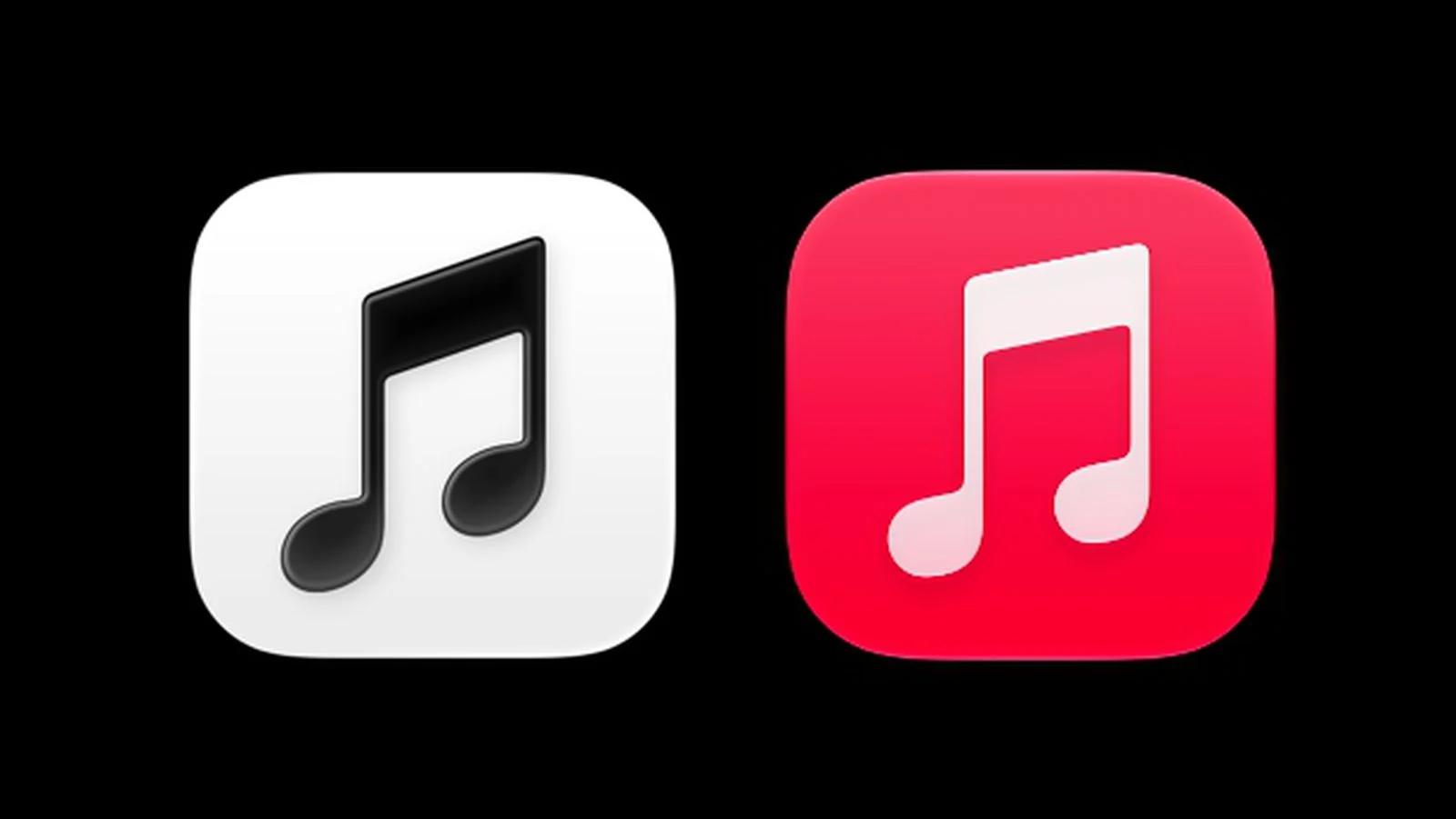
Apple has been trying to continuously modernize the appearance of its applications in recent years, both inside and out, by improving the icon. And it has now prepared a change of icon for Apple Music, although I dare say that this time not entirely happy. In the fourth developer beta iOS 27.2 has quite surprisingly changed the Music application icon, which is losing its characteristic red color, and it seems that this is not just a minor cosmetic change, but part of a larger transformation of the visual identity of the entire music service.
You might be interested in

New icon Apple Music bets on significantly minia more minimalist look than before. While the application icon currently displays a white note on a red background, in iOS 27.2 beta 4, it is replaced by a black note on a white background. In dark mode, the color scheme is then reversed, so users see a white note on a black background. Apple decided to virtually completely remove the colors from one of its most famous symbols.
However, the changes don't just affect the icon itself. Apple It also changed the color elements inside the Music app, replacing the red highlight of the active tab with blue. Some texts and elements in the app settings have also undergone the same change. Widgety Apple Music Instead of the characteristic red background, they now use black. The icons for individual categories in the library, such as playlists, albums, or artists, have also been given a simpler black and white design.
You might be interested in
The question, of course, remains whether Apple this design poneIt is also included in the final version of the system. ProIt is currently only available in a test version. iOS 27.2 and may change during development. However, if the current appearance also reaches regular users, it will be a fairly fundamental visual change. The red color is Apple Music has been around for many years, and replacing it with a black and white combination will definitely be noticeable on iPhone home screens. And I admit that I would be quite sad about this change, especially since we have been used to red for years.


So there will be a non-iconic icon