
Popular communication app WhatsApp continues to gradually redesign its iOS client in the Liquid Glass style, which Apple introduced with the arrival iOS 26. Although most regular users still haven't seen the newer look in the live version of the application, beta version available via TestFlight shows that Meta is still working intensively on the modifications.
You might be interested in
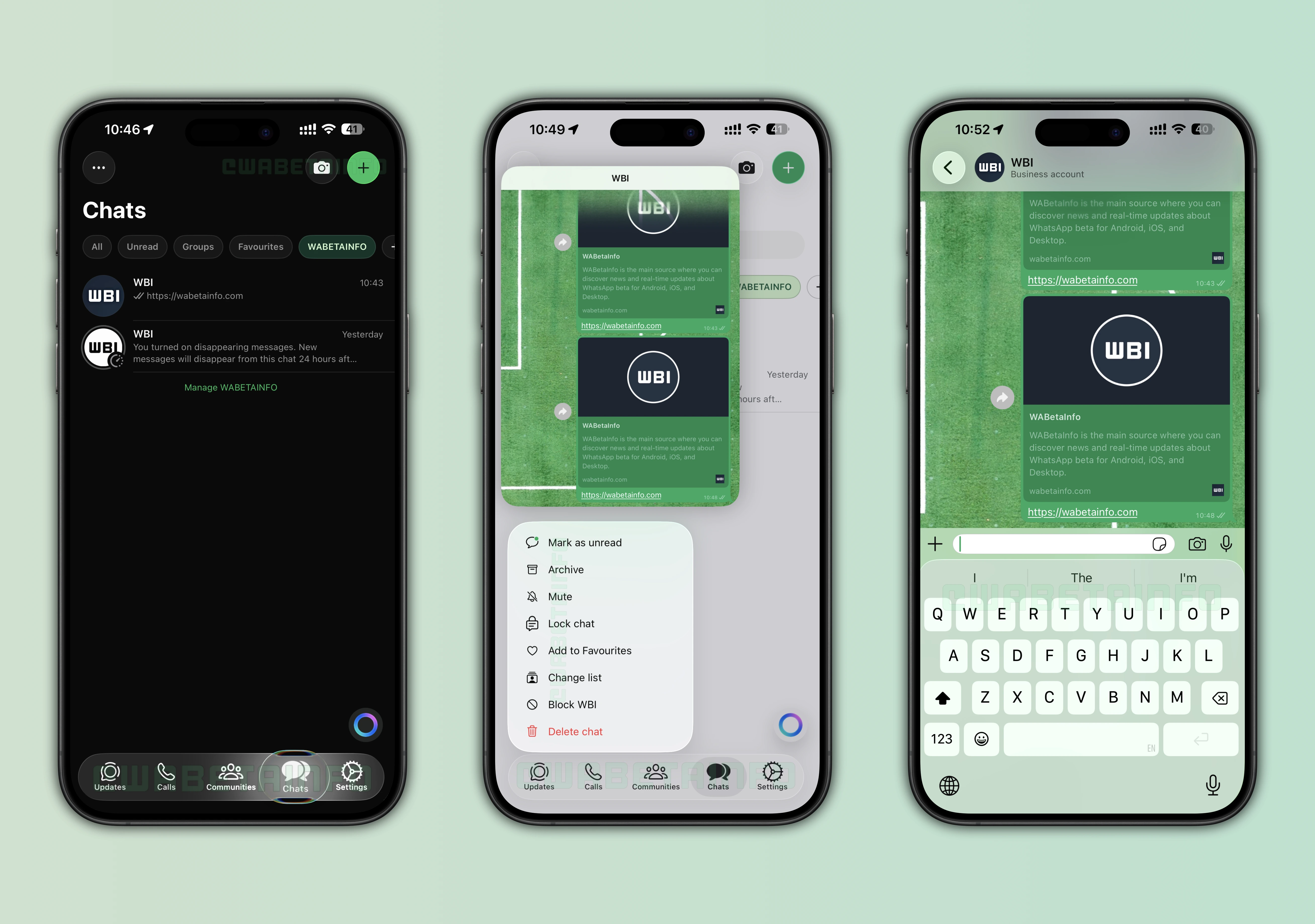
Along the bottom navigation bar, part of the interface Chatand later, the voice message player, two other prominent parts of the application come into play – message reactions and context menus. According to testers, these have so far seemed a bit outdated compared to the rest of the application. The reaction bar had a too opaque appearance, and the menu after holding down a message used a simpler background without any significant transparency effects.
Meta is now trying to visually unify the entire environment. The new elements are supposed to feel more airy, lighter, and more reminiscent of system applications. Appluv u iOS 26. Incidentally, this is a trend that has been observed in recent months among large iOS applications. Liquid Glass is not just about the "glass" effect, but mainly about working with depth, transparency and interface movement.
Interestingly, Meta is implementing the redesign very carefully. The first Liquid Glass elements appeared in the application shortly after its release. iOS 26, but the rollout was extremely limited and many users still don't have them active at all. Beta However, the versions indicate that the company has definitely not forgotten about the new look and is gradually expanding it to other parts of the application.
According to WA serverBetaInfo The new form of reactions and context menus is not yet available to regular users. beta testers. The feature was activated internally for testing purposes only. However, this WhatsAppThis is not unusual. Meta often hides new features in the app for weeks or even months before rolling them out publicly.
What is particularly remarkable about the whole thing is how much WhatsApp in recent years, the iPhone has been trying to make it "more like" iOS". Previously, the application was visually more universal and tried to keep the same interface across Android and Applem. But now it seems that Meta is starting to respect the design language of each platform more. And honestly, it makes sense with Liquid Glass. On the OLED displays of the newer iPhones, transparent layers and subtle blurs often look very impressive.
When exactly will the redesign come into effect? App Store version of the application, is not yet clear. The fact that new elements appear in more and more beta builds, however, suggests that live deployment might not be too far away.


Disgust.