
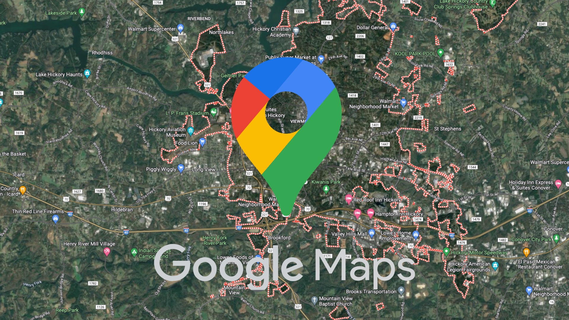
Google Maps will see a minor change. Google is changing the app icon Google Maps, both for Android and iOSThe new look retains the traditional pin shape, but brings more modern proportions to the shape, and many will think (due to the color rendering and subtle transitions) that Google is thinking about AI.
You might be interested in

The changes aren't too drastic, but at first glance you'll notice something is different. The top "ring" of the pin is thinner. The inner circle, on the other hand, is larger and more pronounced. Google has also removed the original color division and replaced it with a smooth four-color gradient, which is apparently intended to remind you of the visual style Gemini and other AI features of the company. The new design starts appearing with version 26.09.06.873668274 on Android. On iOS It comes in version 26.09.5.

The change is likely another example of Google's unification of its visual design. The same style is already used by apps like Google PhotosGoogle Home, Google Search or itself GeminiIn addition to visual adjustments Google Maps In recent months, they have also gained new AI features. These include conversational navigation replacing Google Assistant, better traffic reports, and integration with Gemini within Google Lens and the "Know before you go" function.
You might be interested in

I will honestly say that because Google Maps I probably wouldn't notice the change if I didn't use it. But since I have a bunch of people around me who don't give a damn Google Maps I'll ask them if they've noticed any changes. How do you like the new logo?








I don't understand what the point of these updates is.