
There are things we use every day and yet we never notice them in detail. For example, the ordinary mouse cursor. A small arrow that has accompanied us for decades, a symbol of the computer era. A short video is now circulating on social networks, drawing attention to something that most people have never noticed, the cursor in Windows is not perfectly symmetrical. And once you notice it, you'll see it forever. At first glance, the cursors in Windows macOS is very similar. Arrows with a black outline. A classic that we have known since the 80s and 90s.
Windows The cursor is slightly "tilted" and its left and right sides are not geometrically identical. This is not a rendering error or an optical illusion, it is an intentional design element that goes back deep into the history of graphical interfaces Microsoftu. macOS, on the other hand, uses a cursor that feels more visually balanced. The lines are cleaner, the proportions are more precise, and the whole thing feels smoother. It's not a dramatic difference. But it's exactly the kind of detail that separates "it works" from "it's tight." And it's precisely on details like these Apple builds its identity over the long term.
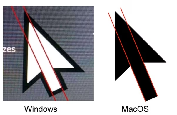
Proč Windows the cursor is not symmetrical?
The original cursors were created at a time when display resolutions were extremely low. They worked with a 16×16 or 32×32 pixel grid. Every pixel had meaning. Design was not about aesthetics, but about readability. Asymmetry in Windows cursor provided better readability and a more precise “click point”. The arrowhead had to be clearly defined. In a coarse pixel environment, it was important for the user to know exactly where the cursor “ended”. This basic shape was then inherited across versions Windows, od Windows 95 through XP to Windows 11. It gradually became smoother, larger, and got more modern shading, but the basic geometry remained. Microsoft he simply preserved historical continuity.
Apple and obsession with details
Since the first Macintosh, the emphasis has been not only on functionality but also on visual harmony. Cursors, icons, typography, everything had to feel balanced and natural. In macOS, the cursor is designed to be not only precise, but also visually “clean”. The edges, angles, proportions, nothing feels random. Apple Additionally, in recent years, it has added adaptive cursor resizing when moving quickly to make it easier to see on large monitors.
It's fair to say that Windows The cursor is not “bad.” It works. It’s iconic. Millions of people can’t stand it. But it’s also a testament to how powerful technological inertia is. Design decisions from the 90s survive to this day. And they only change minilittle by little. Apple on the contrary, it does not hesitate to gradually modify the visual language. macOS has undergone several major transformations, from skeuomorphism to flat design to a contemporary aesthetic inspired by iOS.



Good God, try seeing a specialist. This is getting serious. (I'm a user of a perfectly good Mac from a company that is obsessed with details)