Technology often changes at breakneck speed, and of course the respective companies adapt to the trend of constant change and development. This includes not only the constant development of the offered goods and services, but also the visual presentation, including the logo. Let's take a look at a few of today's tech giants and how their logos have changed over time.
You might be interested in
Yahoo
Yahoo is one of the symbols of the world of technology and the Internet at the turn of the millennium. The logo of this company has changed quite significantly over the years. In 1995, in addition to the typical inscription, it also included a simple drawing, in the following years the logo consisted only of the inscription "Yahoo", and in one case even of just the letter "Y". Yahoo changed its logo relatively recently, three years ago.
Gallery


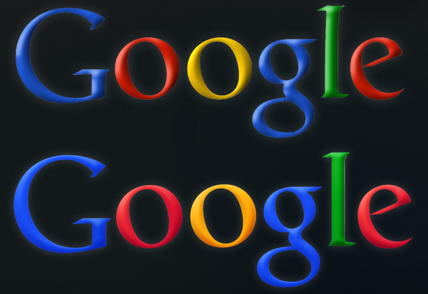
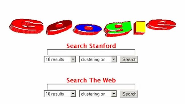
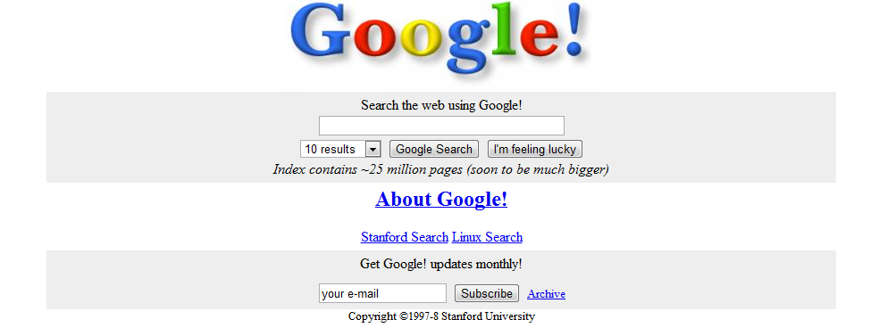
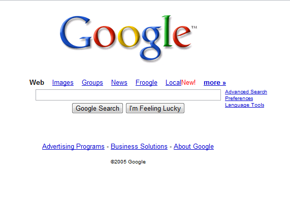
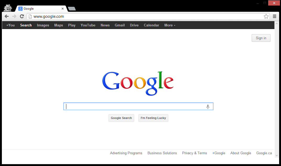
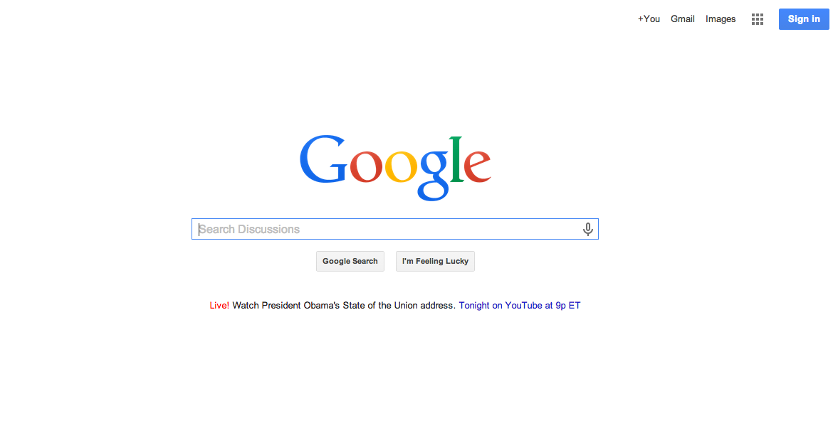
Google has never skimped on colors in its logo. However, over the years, the appearance of the inscription in the logo has changed. Even in the second half of the nineties, the Google logo was playful, dancing, and in a way resembled the legendary WordArt. By the time Google officially launched, however, the logo had become more static. In 1998 and 1999, there was an exclamation mark at the end of the inscription – similar to the Yahoo logo – and over the years the letters acquired a more austere shape. However, the color scheme remained the same throughout. By the way – do you remember the story about how Steve Jobs decided to Google advise on the color of one of the letters in the logo?
Gallery

Apple
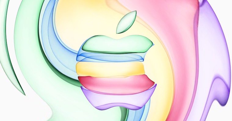
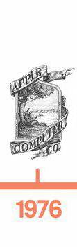
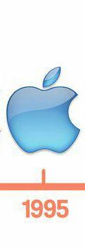
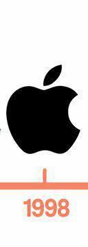
Due to the focus of our website, today's review must also mention the ongoing changes to the company's logo Apple. The apple was featured in the company's logo from the very beginning, but you would have to look for it for a while in the first ever logo. In 1977 however Apple he went from a rather complicated drawing to the simple shape of a bitten apple, which still symbolizes Cupertino society today, only in changed colors.
Gallery



Microsoft
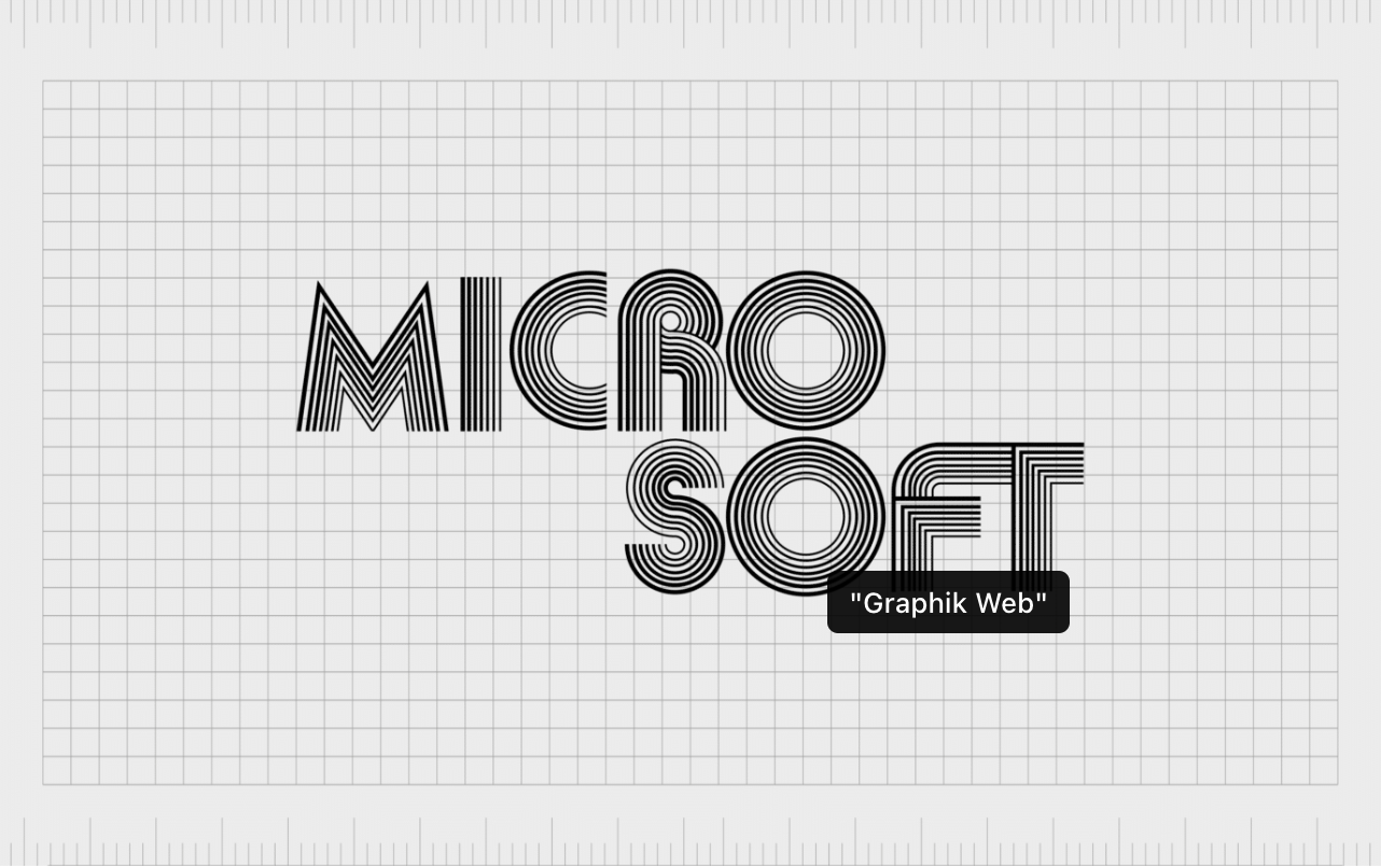
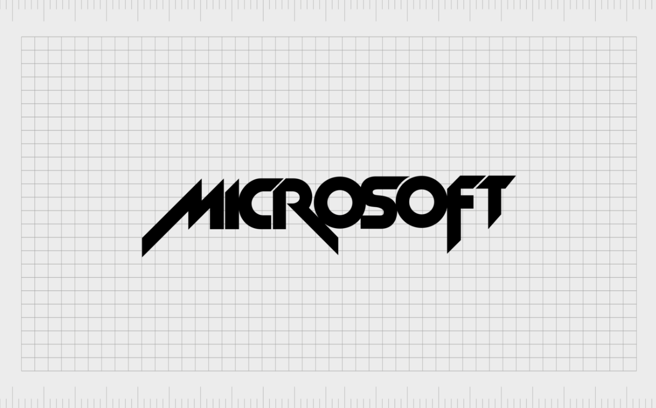
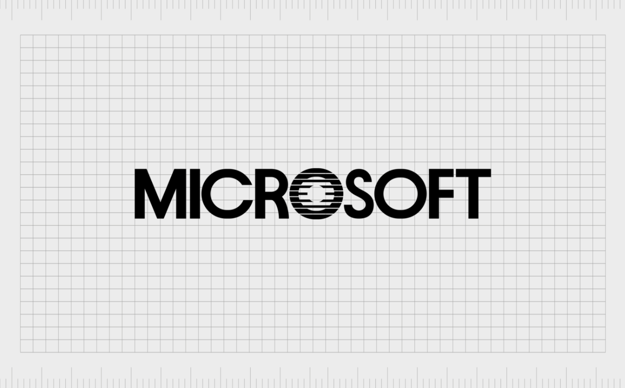
The company logo has also undergone a number of changes since the mid-1970s. Microsoft. The original logo was designed in dark colors and a rounded font. Over time, the letters acquired sharp shapes, but we had to wait a while for the colors. Currently, the company logo is MIcrosoft consisting of, in addition to the inscription, a quadrangle of colored squares, reminiscent of the colors of some of the products and services from Microsoftu.
Gallery
Nokia
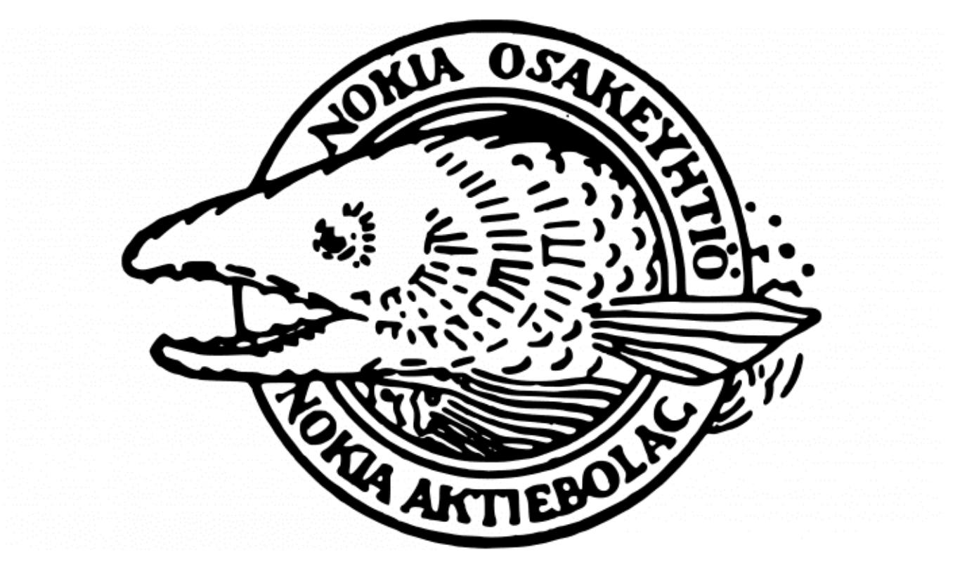
The Nokia company was one of the successful players in the field of mobile phones, especially at the turn and beginning of the millennium. Most of us are familiar with its blue logo, but that was not its original form. The Nokia company has been operating since the 19th century, although its focus was understandably different then. Its first logo corresponds to this, in which, in addition to the company name, there is a drawing of a fish and Finnish inscriptions. The Nokia logo took the form of a blue inscription only in the 70s, and over time the inscription "Connecting People" was added. However, it disappeared after a while, and the color tuning of the company logo changed to a white inscription on a blue background.