
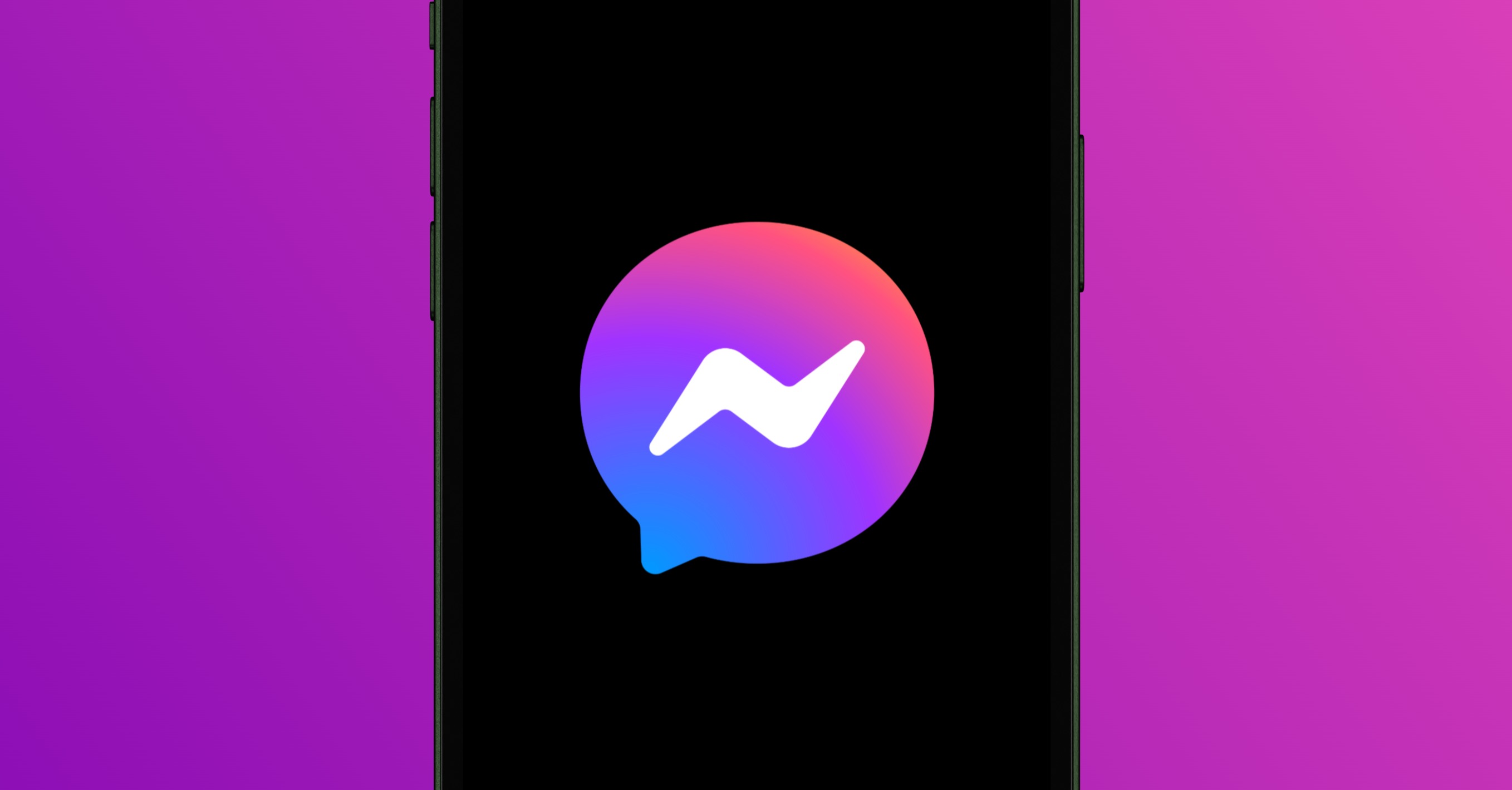
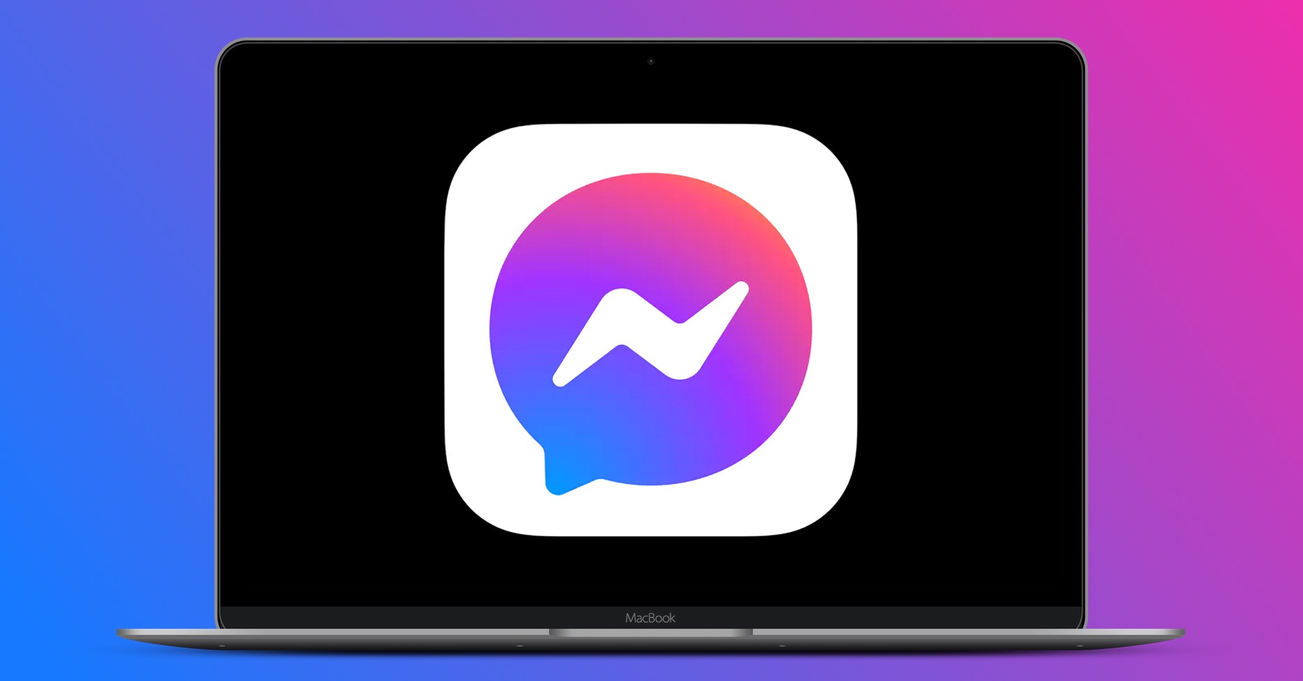
If you have updated to in the past hours or days iOS, Android or macOS application Facebook Messenger, you might have been surprised to see that your logo has changed – from a blue bubble to a purple-blue bubble. Then in the same color Facebook he also recolored individual fibers chatwhich are probably supposed to look more modern as a result. ProIs that so?
Gallery
The answer to this question is absolutely simple and in a way logical. It wasn't that long ago that Facebook officially announced the connection Facebooku Messengervia Instagram Direct – so chatthe Instagram app interface. And by recoloring the icon Messengeru want to change the colors of the Instagram icon Facebook visually highlight this new feature to users and, overall, with this step, de facto enter a new era of its chatplatforms.
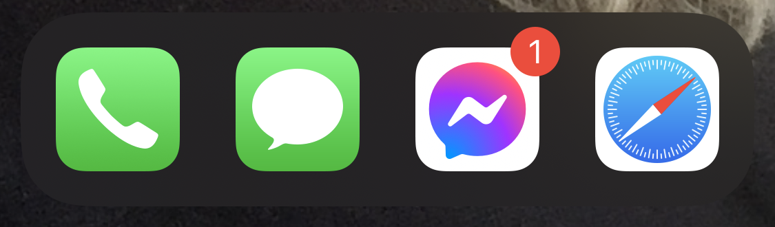
It is quite interesting that while Facebook or Instagram has undergone several logo upgrades over its existence, Messenger has now received an icon upgrade for the first time in nine years of its existence on Android and iOS. It arrived on these platforms specifically in August 2011 with the classic logo in the form of a light blue bubble. With this in mind, it must be clear to everyone how important Facebook connecting it Messengerus with Instagram. It should be noted, however, that changing the icon color seems to be unadjustable at the moment. As for the color chatu, it is still possible to select it directly in the specific chatthis thread.
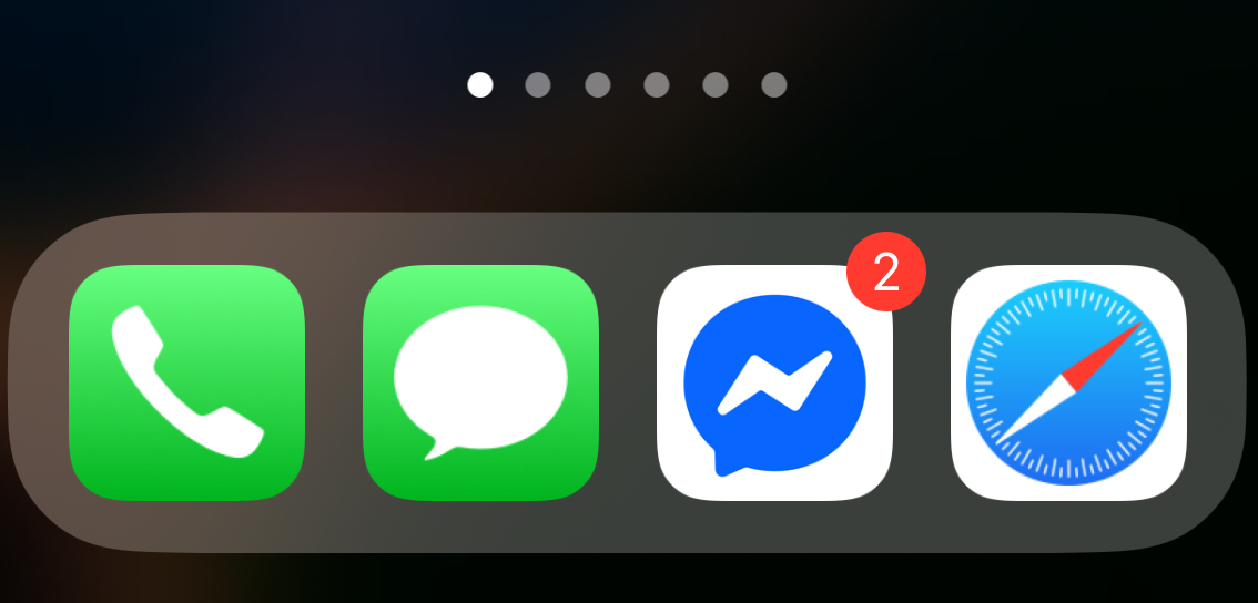

Facebook Messenger he's changed the logo at least once before :D
👍🏿
I think so as well
Yes, in 2018 ... from sharp edges to rounded :-) https://en.wikipedia.org/wiki/Facebook_Messenger
Yes, but there the difference is more or less minor. I was mainly referring to the change around 2013 – https://logos.fandom.com/wiki/Facebook_Messenger
Well, that's good clickbait... (see Huja).
Lol and I thought it was some kind of LGBT month/weekend/day or hour... :D
So I would rather like it if the tone of the notification could be changed ♀️ 🤦🏼
Search the settings and you can change everything…
they could have directly modified the UI for Big Sur when they made changes... IINA already reflected Big Sur for example.
I would assume that the expected integration with Instagram will happen. Therefore, they are slowly starting to prepare more conservative users and after the full merger they could only redesign the UI. There are a lot of people who can't stand it when the UI changes under their hands all of a sudden and it's them Facebook doesn't want to break..
I use Nova Prime launcher and custom icons. Nothing has changed on my desktop, in the app drawer or in chatThe only place I see a change is in sharing with external applications, where the logo is rainbow.
The changes will be gradual. The logo is being changed now and the colors should change. chatand the possibility of your own reactions. Then there should be a connection with IG.
When they connect like that messenger What is the official Threads app?