
Google has started gradually adding a new layer to its Google Maps that displays current data on the increase or decrease in the incidence of oneCOVID-19 pandemic. A new type of map display is gradually starting to appear among owners of mobile devices with the operating system iOS and Android. In the version Google Maps The aforementioned layer is still missing for web browser interfaces.
You might be interested in
Gallery
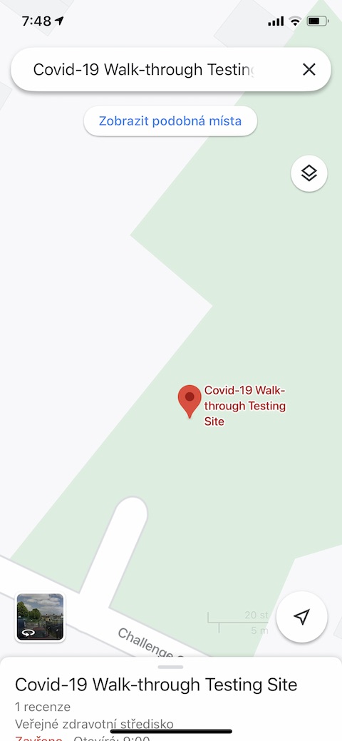
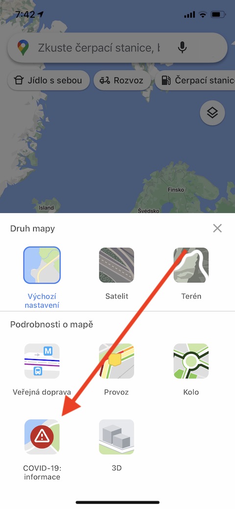
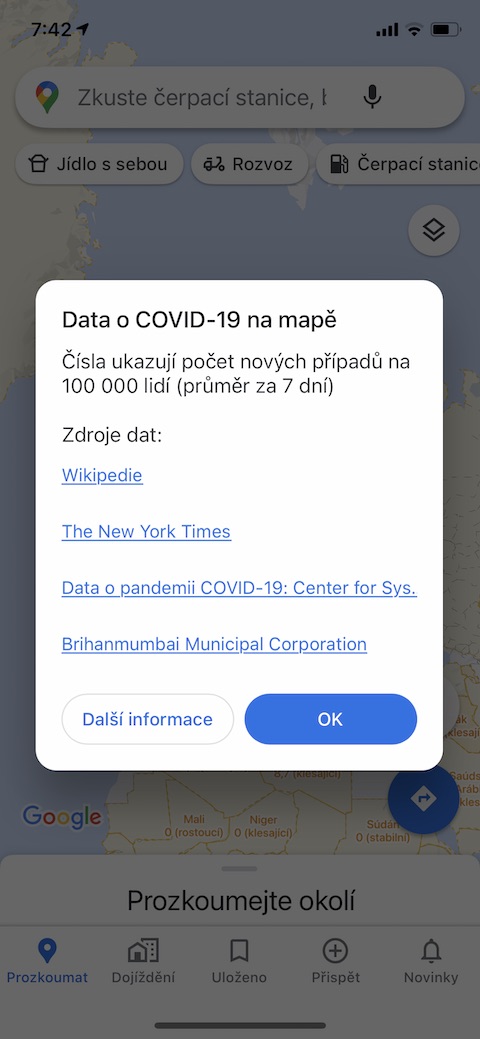


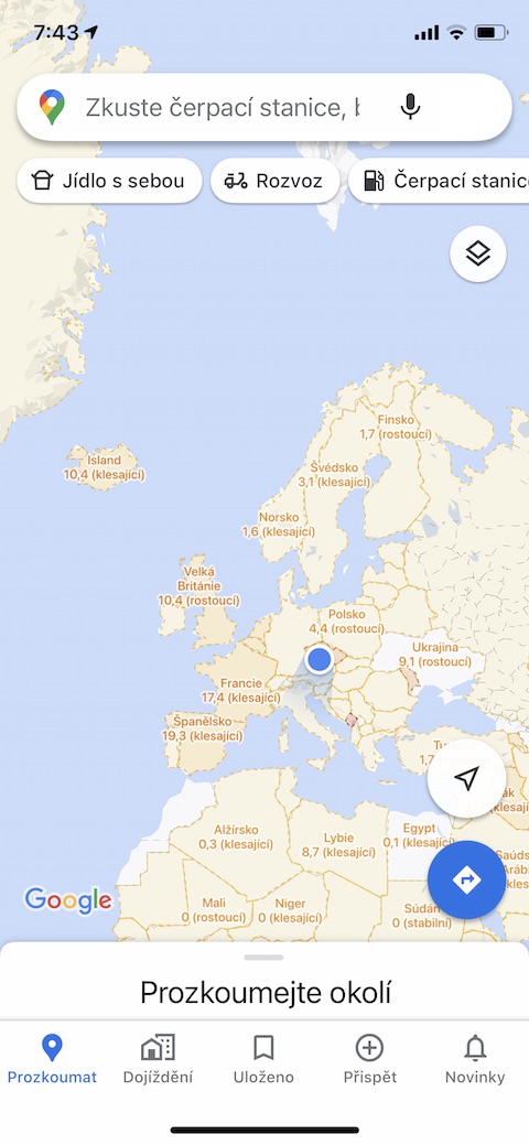
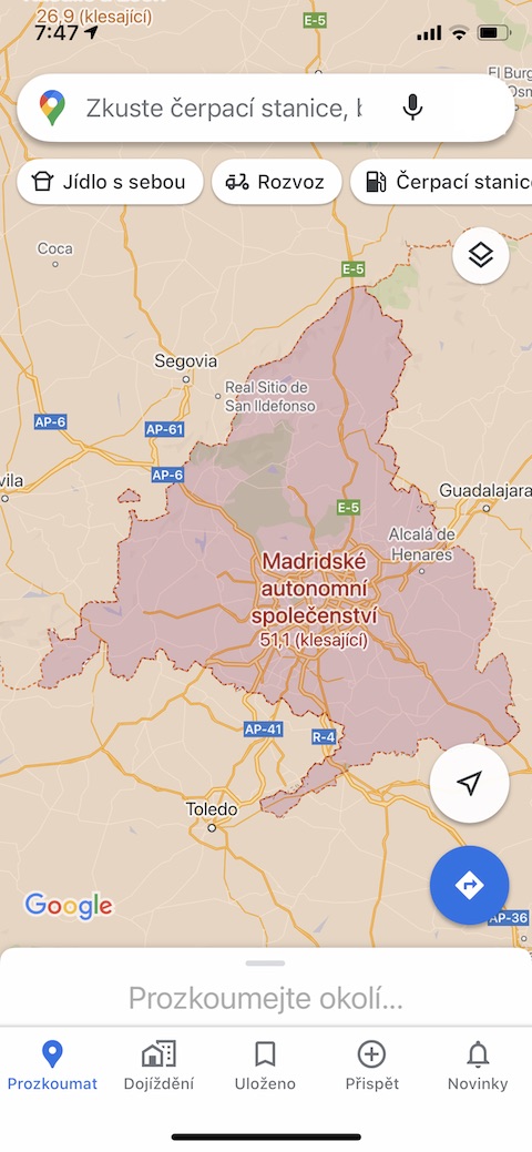
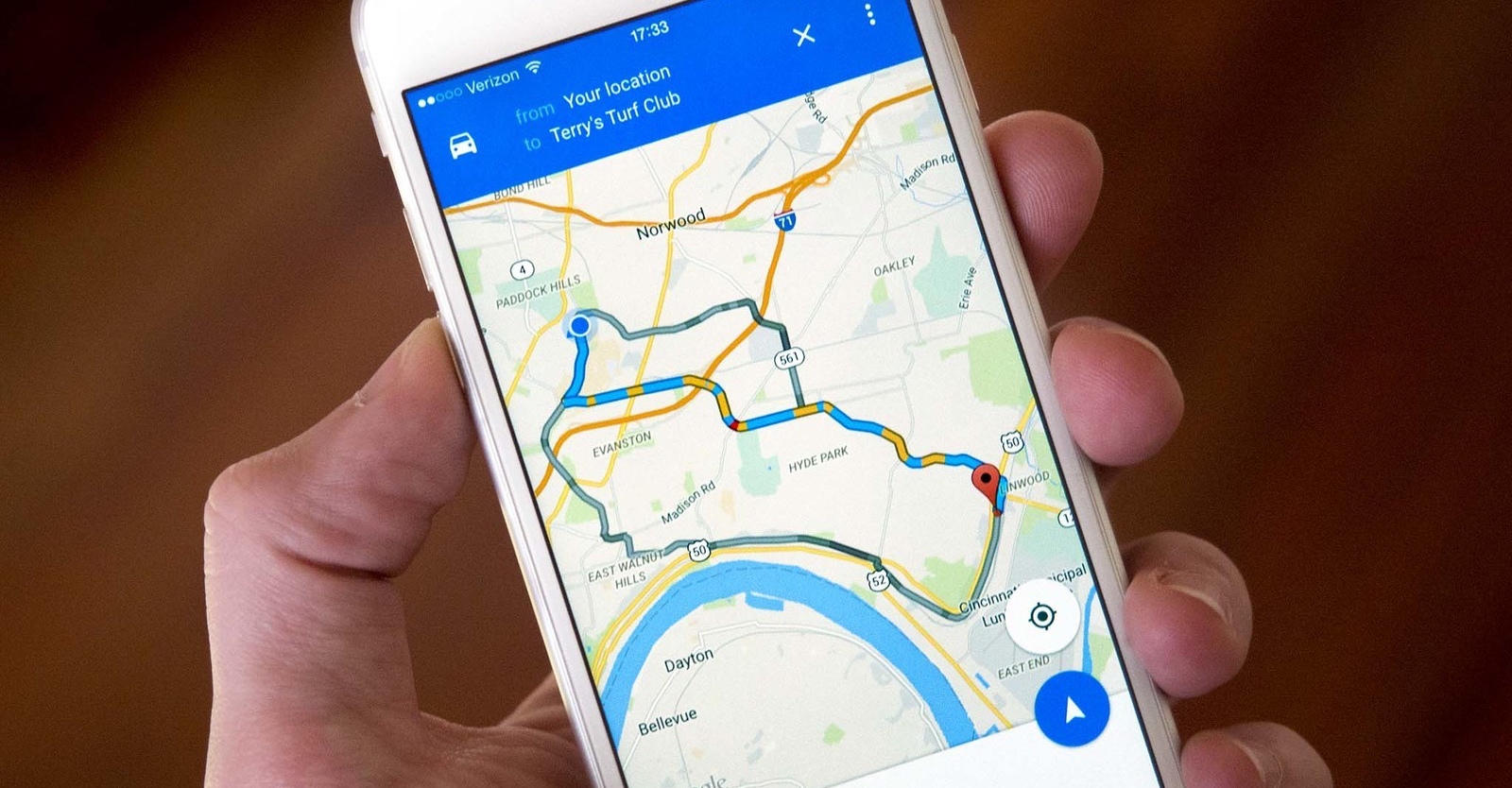
To introduce a new layer in mobile versions of the application Google Maps The new feature is designed to help users decide whether they can actually travel to a destination. The new map view is already available for users in the Czech Republic. Pro display of current information about occurrence and increase or decrease oneCOVID-19, just launch the app on the relevant mobile device Google Maps and tap the layers icon in the top right. In the menu that appears, select COVID-19 information and zoom out until you see a world map with differently colored areas and information about whether the incidence of coronavirus in individual countries is decreasing or increasing. The data on the map shows the number of new cases per 100 people on average over a seven-day period, with the relevant data always coming from several different sources. In Google Maps You can also search for COVID-19 testing sites.









And what about adding layers about malaria, yellow fever, jaundice, measles, tuberculosis 🤔🤔
Well, it will tell you not to go there if you don't have to, that there is Covid there.
If you CAREFULLY read the website of the Ministry of Foreign Affairs regarding the countries of the world and then follow where people drive - no one fundamentally takes into account the risks ... (health)
Yes, as a SCARY it is certainly great - the next step is only to drive the "positive" ....