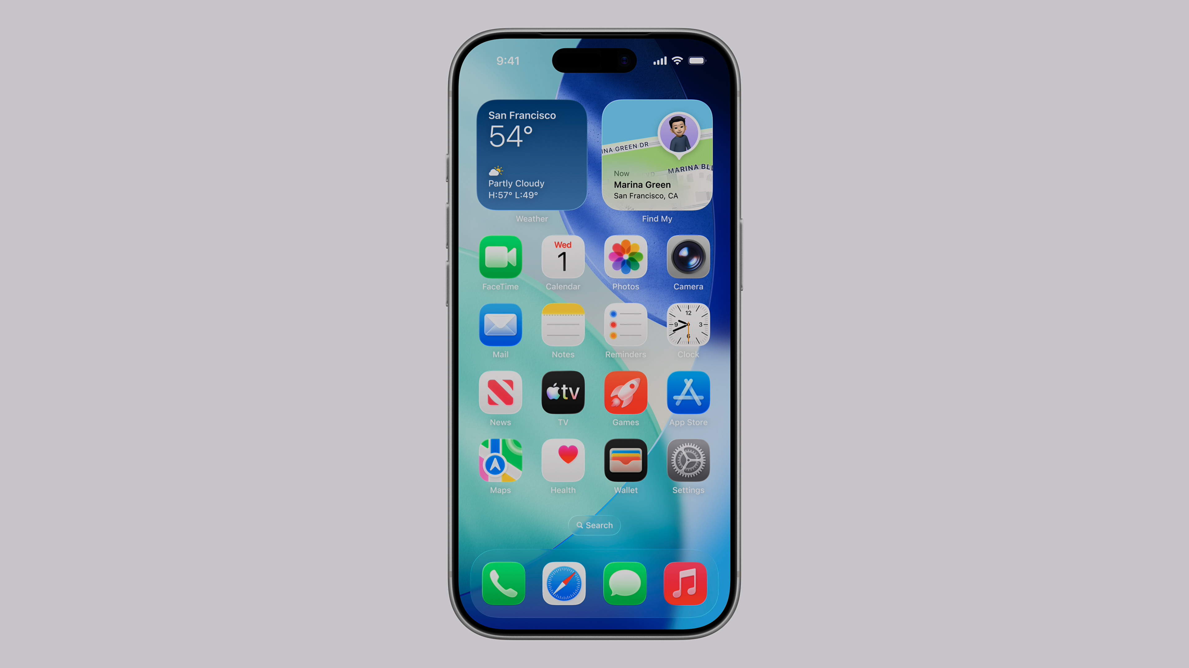
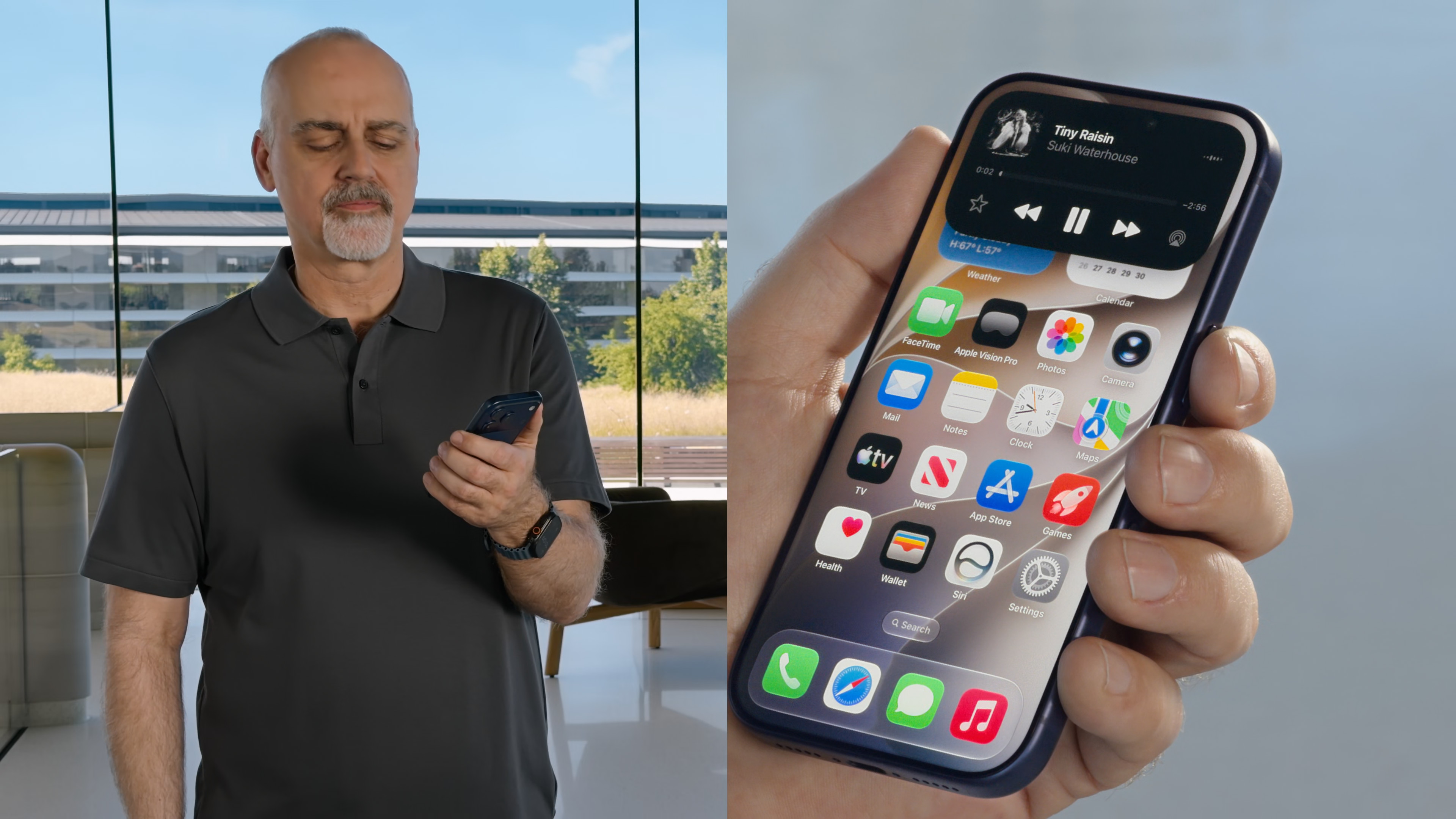
When Apple introduced the Liquid Glass design language last year, which was one of the biggest visual changes to the iPhone in recent years. Part of the transformation included completely redesigned app icons, which were given a glass look, more pronounced depth, and new lighting effects. Although the new style found many fans, criticism was not long in coming. Many users complained primarily about the blurry appearance of some icons, too pronounced reflections, and an effect that sometimes overlapped the app graphics themselves. Apple therefore decided to respond and in iOS 27 brings another significant icon change across the entire system.
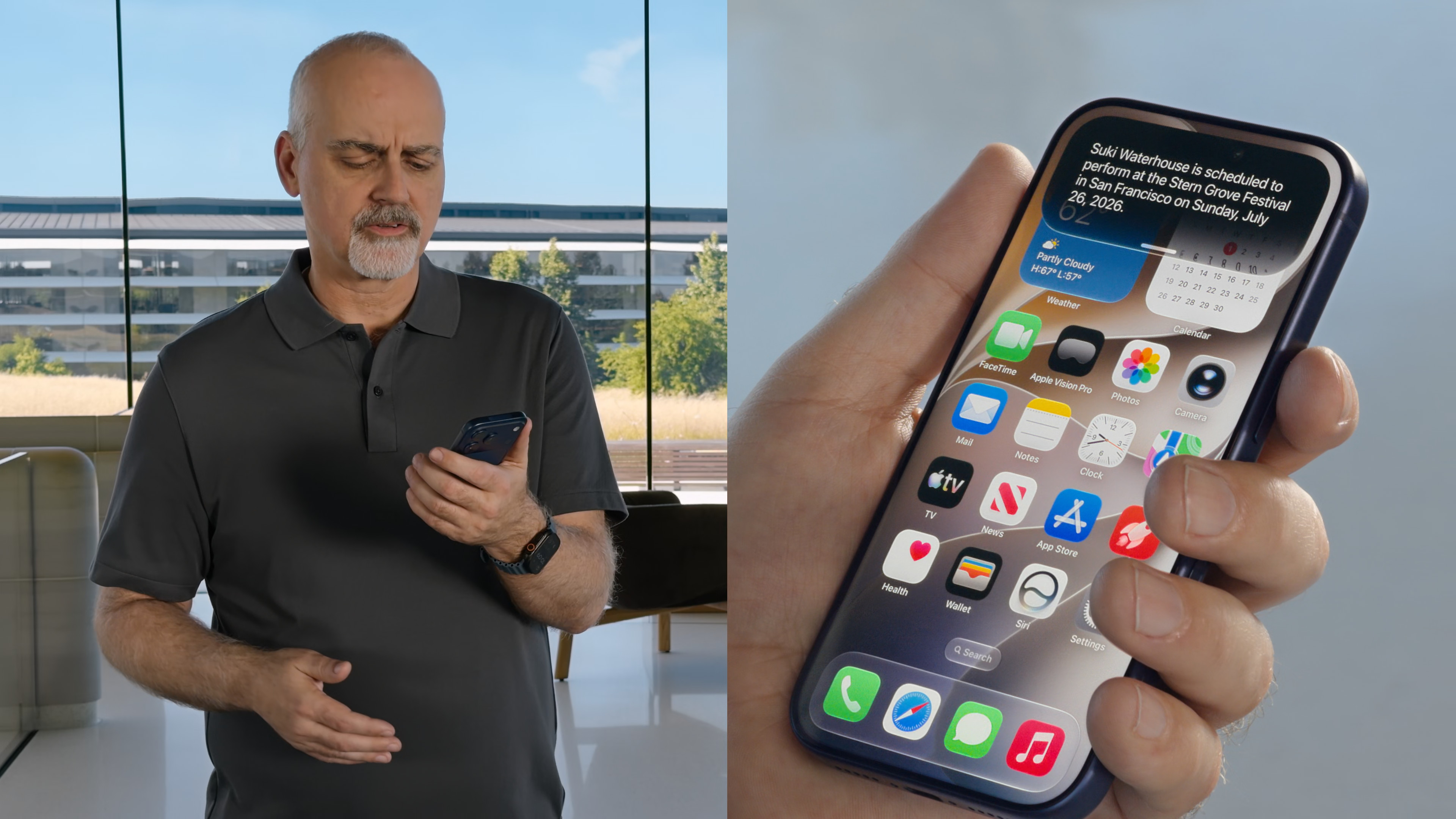
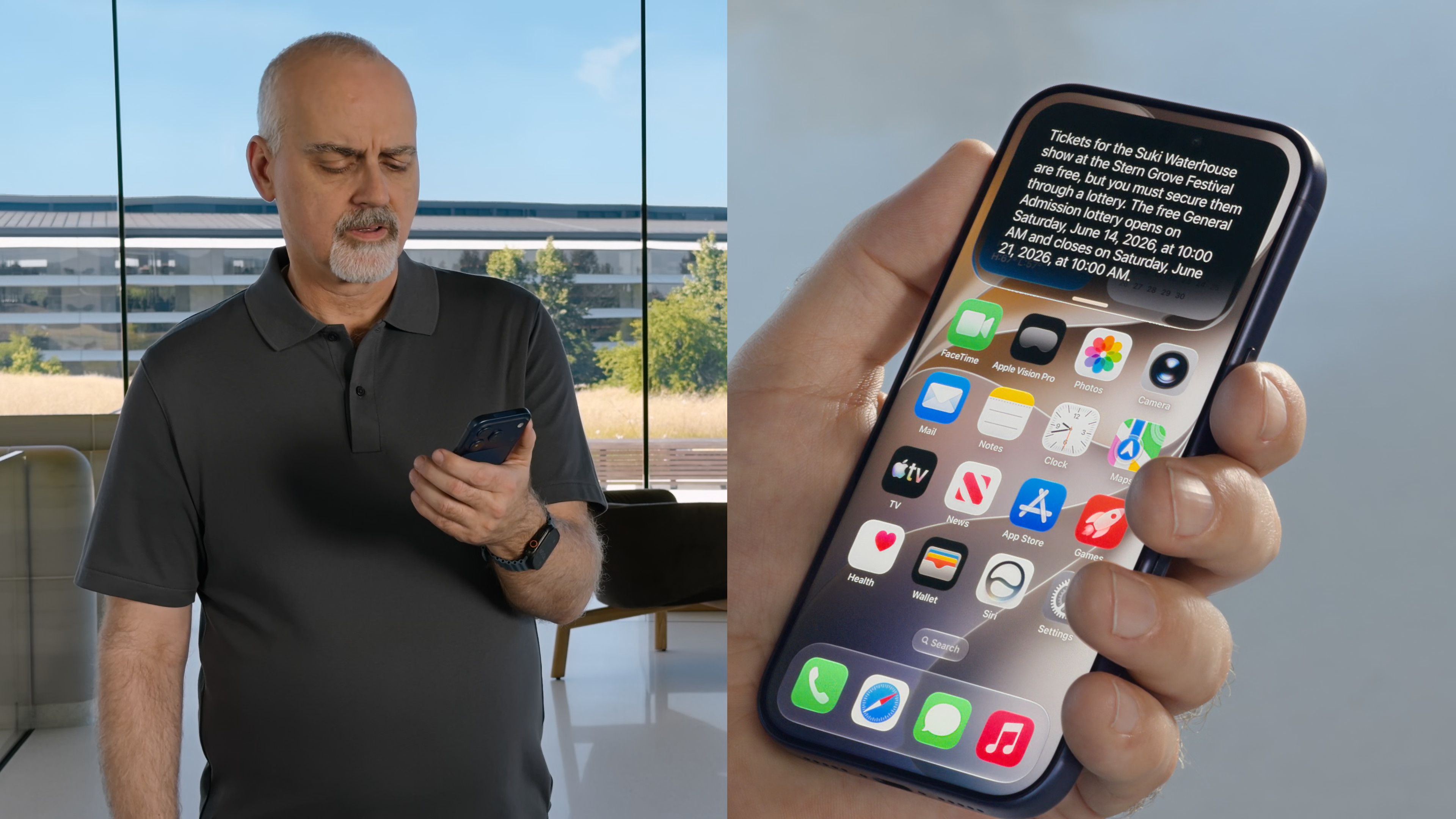
The main change is that Apple redesigned the very construction of the icons. While in iOS 26 the glass effect appeared as a uniform layer over the application graphics, in iOS 27, the individual Liquid Glass layers are built directly into the icon design. The result is significantly better separation of individual elements, sharper edges and higher contrast. In practice, this means that application logos appear more detailed and stand out better even at first glance. The glass effect has not disappeared, but it no longer overwhelms the icon content as aggressively as before. Apple apparently tried to preserve the character of Liquid Glass, but at the same time eliminate its biggest weaknesses.
An even more interesting change concerns an effect that has earned quite mixed reactions among users. In iOS 26 icons responded to the movement of the phone, changing their reflections depending on the tilt of the device. However, some users pointed out that this made the icons appear crooked or tilted to one side. Apple this effect in the first beta iOS 27 has practically eliminated it. The icons retain their subtle light highlights, but the reflections no longer react to the movement of the phone and do not create the optical illusion of tilt. This change is among the most frequently mentioned in the first reactions of testers.
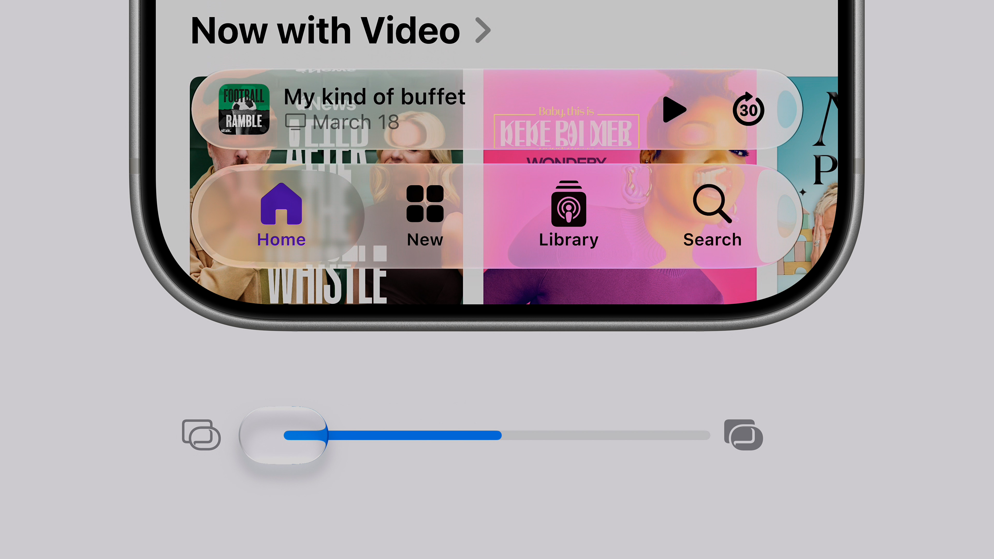
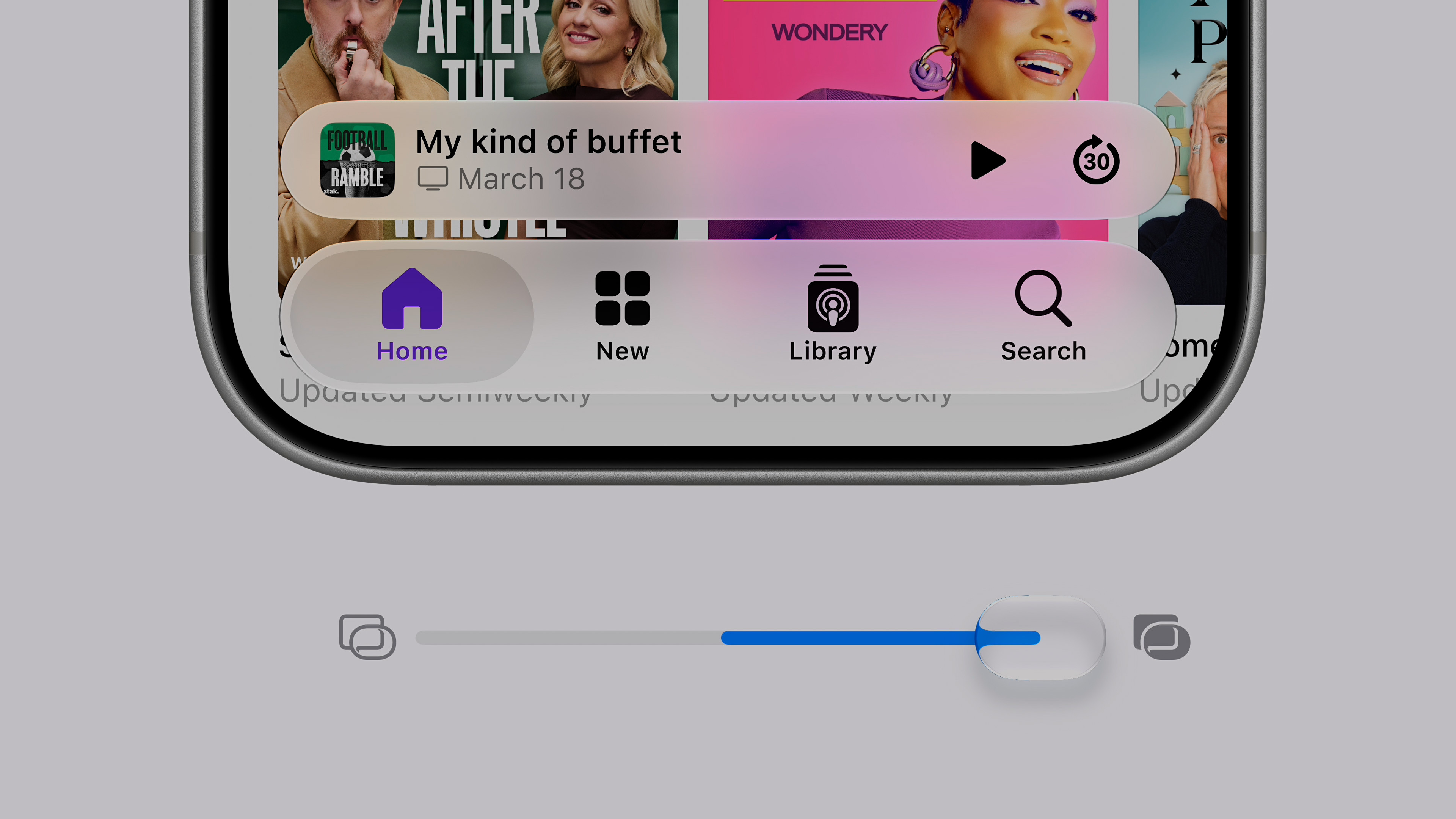
The entire adjustment fits into a broader strategy Appfor iOS 27. On WWDC In 2026, the company announced a number of improvements to Liquid Glass that are intended to improve readability and give users more control over the system's appearance. For example, a new transparency slider has been added, allowing you to adjust the intensity of the effect to your preference. It seems that Apple is not backing down from its new design direction. Instead, it is gradually adjusting it based on user feedback. Icons in iOS The 27 therefore does not represent a return to an older style, but rather the second generation of Liquid Glass, which seeks to maintain a modern look while eliminating the most common complaints.
Developers get new tools
Developers will also have to prepare for the changes. Apple has updated the Icon Composer tool, which now supports the creation of icons from multiple Liquid Glass layers. Now you can more precisely adjust the refraction effects, reflections or behavior of individual layers and see in real time how the resulting icon will look in the system. This means that third-party applications should gradually receive the same adjustments. Initially, the changes mainly concern applications directly from Applu, but with the arrival of the final version iOS 27 in the fall, the appearance of many other icons will probably also start to change in App Store.
Although it may seem like a small thing at first glance, changing the icons clearly shows how Apple is currently entering development iOSInstead of revolutions between versions of the system, they focus on gradually fine-tuning the details that people use every day. And icons are one of the things that users look at dozens or hundreds of times a day. So if Apple managed to remove the blurry appearance and optical illusions that some users criticized, this may be one of those changes that will not be the main topic keynote, but practically everyone will appreciate them when using the iPhone every day.
Well, that's a fact so pronounced that I almost fell off the handle.
I don't understand the criticisms - the difference between the 26 and 27 versions is almost zero. And there's not much to criticize about the old ones.
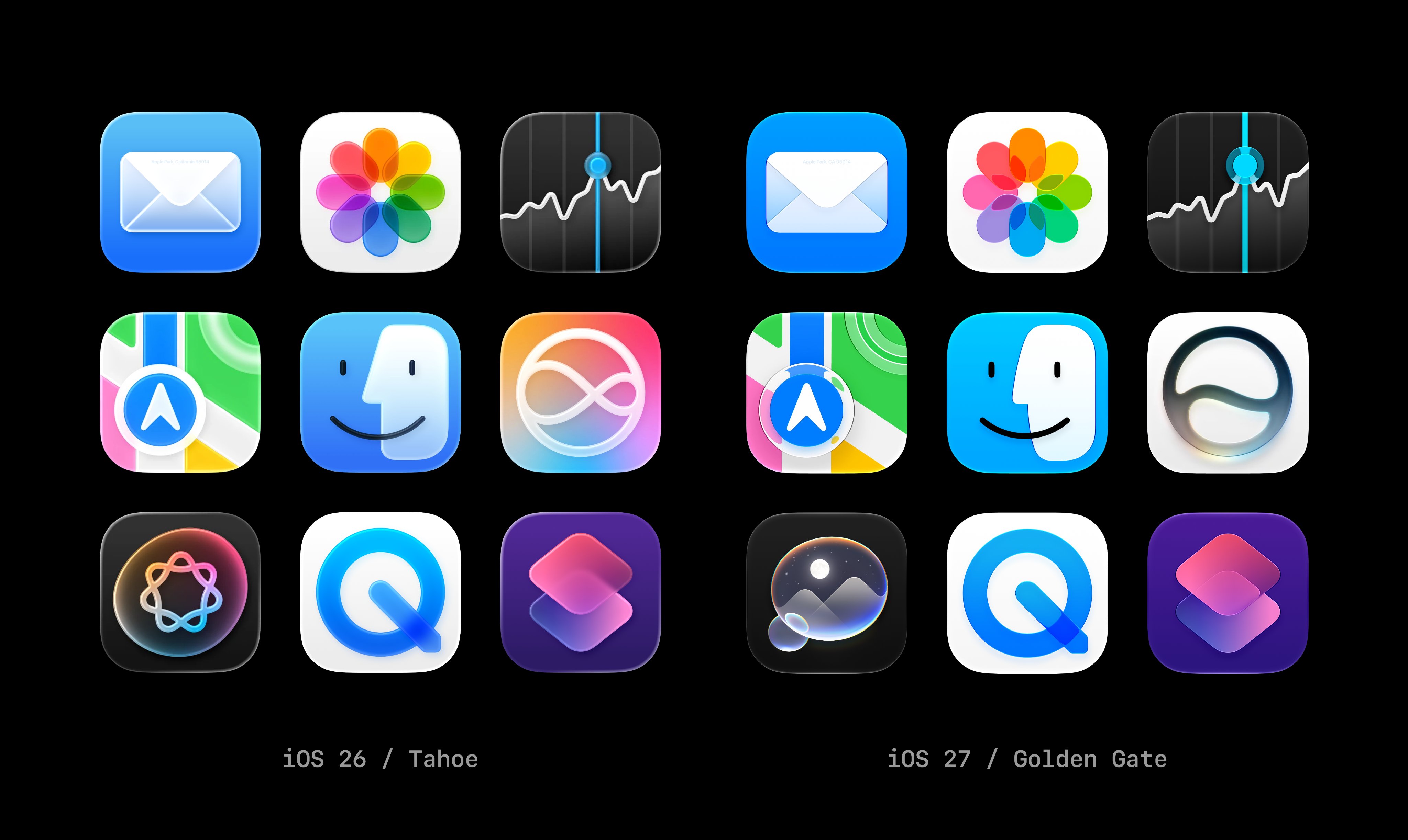

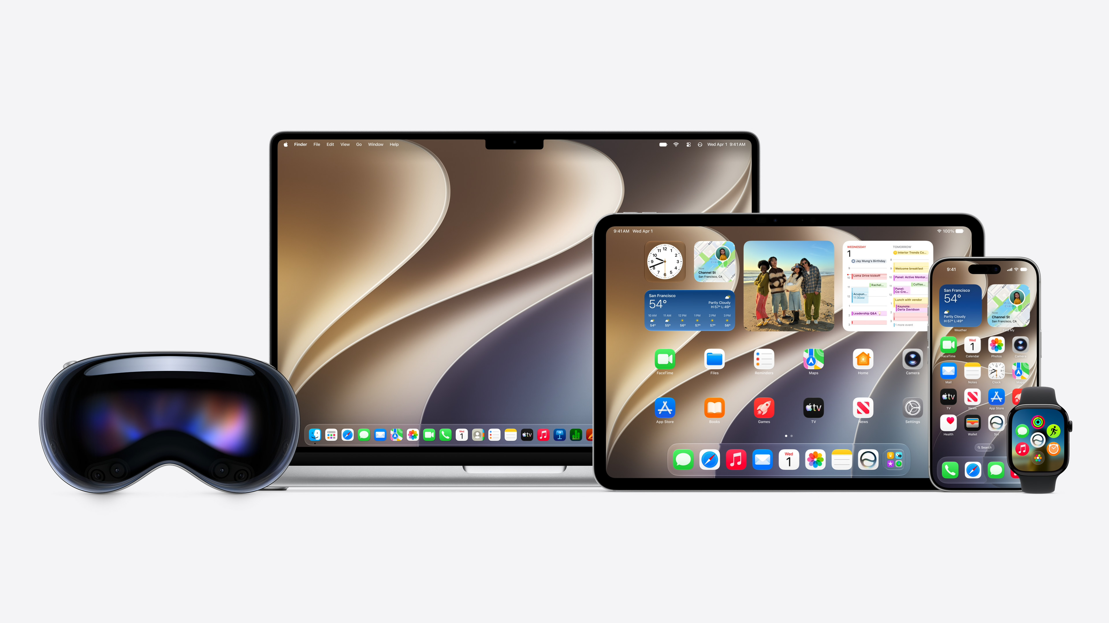












Well, I don't know. minialmost no mail, maps, finder aj siri For me, the ones from 26 are definitely better.
Well, that's a fact so pronounced that I almost fell off the handle.
I don't understand the criticisms - the difference between the 26 and 27 versions is almost zero. And there's not much to criticize about the old ones.