
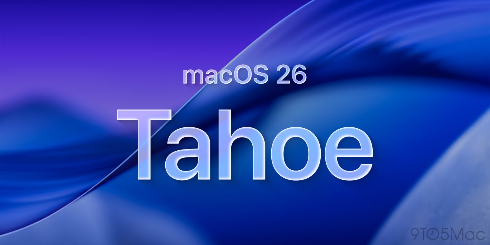
Apple has been gradually unifying the visual style of all its systems recently. After the arrival of Liquid Glass design in iOS 26 and tvOS 26 have now been released for macOS. Current beta macOS version 26.1 Tahoe brings not only new effects and improved icons, but also a redesigned look for one of the most iconic ones – Macintosh HD.
You might be interested in
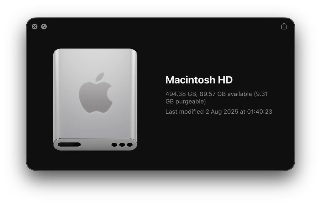
The icon was supposed to symbolize modern SSD storage instead of the original hard drive, which has long been discontinued on Macs. But the result did not make a good impression on users. Many noticed illogical details – Apple The logo was drawn at a strange angle, the perspective of the disc didn't make sense, and mysterious holes appeared on the body andonewhich do not exist at all in the real device.
New version
Apple has clearly taken the criticism to heart. The current macOS 26.1 beta features a modified variaThe Macintosh HD icon has been redesigned to look cleaner and more realistic. It retains the glossy Liquid Glass effect, but it's corrected the perspective, removed unnecessary ports, and better balanced the proportions. The result is an icon that feels more in line with the rest of the system—modern, but still respectful of the iconic history of the Mac. While the version from macOS 26.0 looked more like a portable SSD, the new varianta visually approaches internal storage again, which truly corresponds to today's Mac architecture.
Gallery
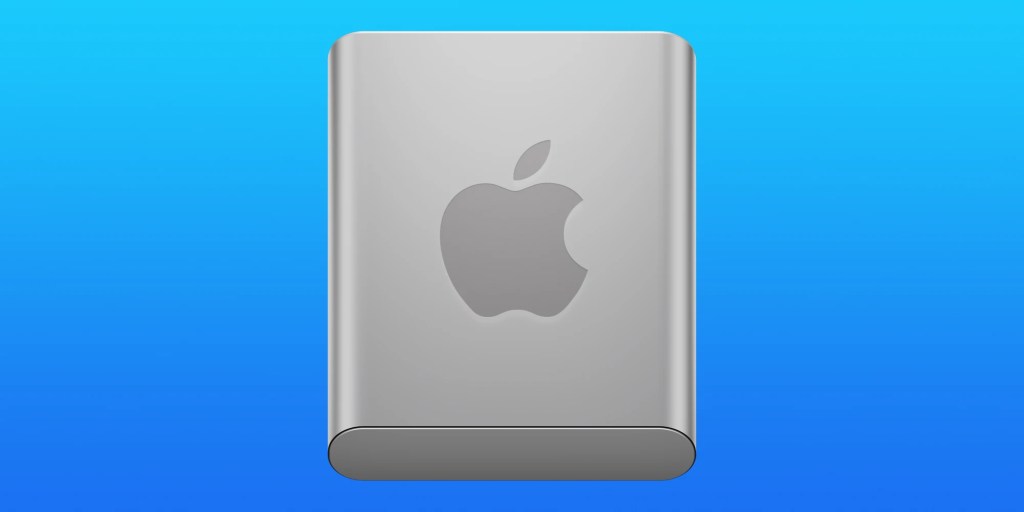
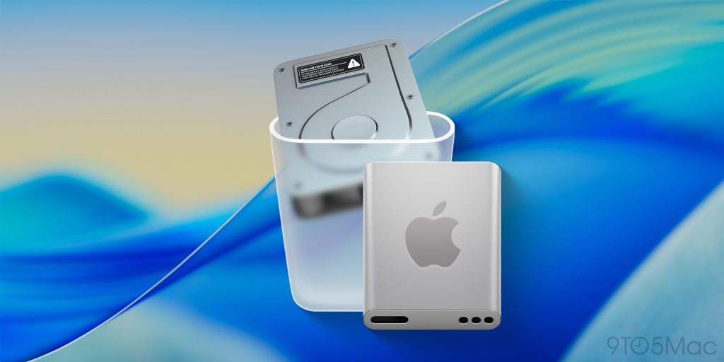
At first glance, it may seem like a small detail, but in the context of macOS, the Macintosh HD icon has almost cult status. It is a symbol of the beginnings of Macs, accompanying the system since the 80s - although its graphic appearance has changed many times over that time. Therefore, interference with its design always provokes strong reactions, and Apple seems to be aware of this. The new Macintosh HD icon in macOS 26.1 Tahoe shows that Apple is listening to feedback – at least in the details that mean more to long-time users than you might think. The new version is betting on a cleaner shape, better perspective and a subtle use of the Liquid Glass effect, which unifies the entire visual language of this year's systems. Whether it is better or worse than the original remains to be seen – but what is certain is that it is different.




I wish it would Apple koneagreed with Microsoftem on native support for the NTFS file system, Windows 10 ends, Windows 11 is not for everyone due to enforcement Microsoft account and Linux distributions may not necessarily suit everyone. There will certainly be a few refugees from Windowswho will switch to Mac and want their data storage from Windows also use on Mac.
Hopefully that will be enough...