The bitten apple logo is inherent to the company Apple practically from its beginning. All of you probably know that the very first logo of the Cupertino company looked completely different. Likewise, you all know about the color changes of the apple logo. In today's article, we will discuss the history and transformations of the apple company logo in a little more detail.
You might be interested in
From Newton to the rainbow
Gallery
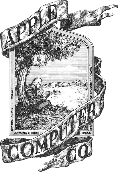
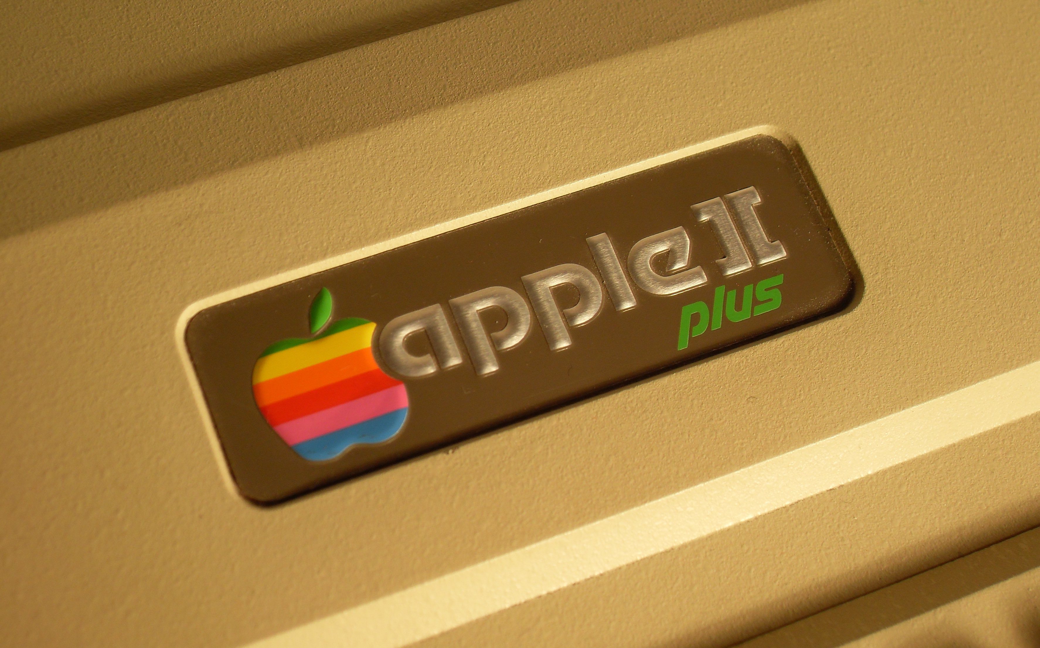
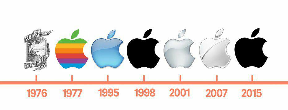
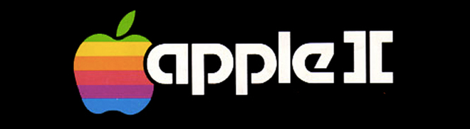
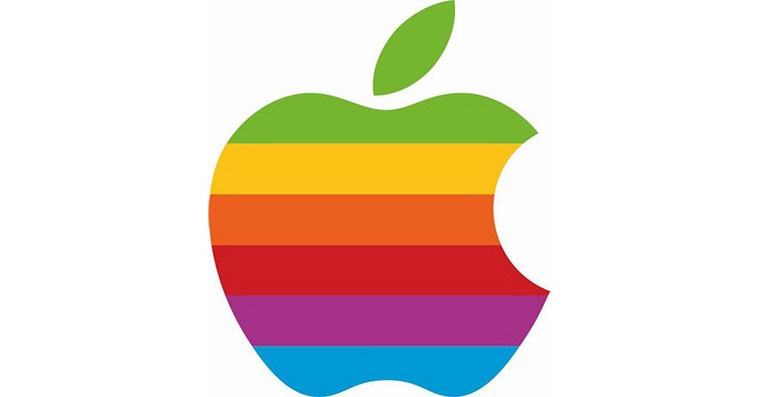
While today it rules the company's logo Apple simplicity and minimalism, the first logo did not really have these qualities. It was created by the third co-founder Applu Ronald Wayne. The logo resembled a linocut drawing depicting Isaac Newton sitting under an apple tree from which an apple was falling. The logo featured a quote from the English poet William Wordswortha: “The mind, forever wandering the strange waters of thought.” The logo was elaborate, but it was not very suitable for placement on products and Steve Jobs began to feel outdated over time. Rob was commissioned to design a new logo Jannoff – and the shape he designed became the basis for all future Apple logos. There is often speculation about the reason why the apple in the company's logo is bitten. Janoff himself stated that he chose this form out of concern that people would confuse the apple with another fruit. The bite was also intended to symbolize knowledge and was a reference to the corresponding, similarly sounding term ("byte") in the field of computer technology. The apple in the logo Applu was originally rainbow-colored. The colors were meant to symbolize a computer's color screen Apple II, but their order was mixed up. "One of the biggest mysteries for me is our logo," Jean Louis Gassée, one of the company's former executives, once stated in this context Apple. “A symbol of sin and knowledge, bitten and lined with the colors of the rainbow in the wrong order. I can't think of a more apt logo: sin, knowledge, hope and anarchy.'
Brilliantly simple, simply brilliant
Gallery
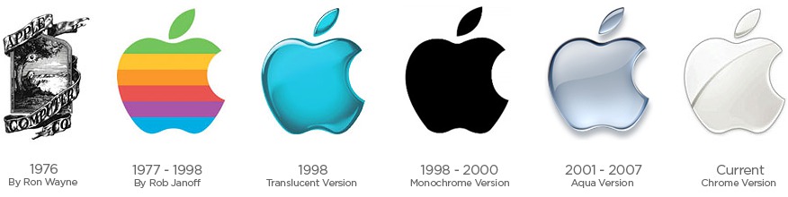
The rainbow-colored Apple logo lasted for 22 years. When it was Applu returned in 1997 Steve Jobs, wanted to move towards something simpler – one of the reasons for this decision was, among other things, the need to reduce financial costs, and producing a color logo was simply more expensive, especially when it came to placing it on computers. Michael M. Scott, one of the employeesanců Applu, called the rainbow apple the most expensive logo ever designed. The bitten apple thus acquired a “glassy” appearance, and the company published a document in connection with its change, in which, among other things, it wrote about the development that both the company and its customers are going through. The bitten apple was, according to Applu is a timeless symbol, the design of which has only been simplified over time and stripped of some unnecessary elements. “In other words, we took some of the standards and innovations that make our products and design unmistakable and applied them to the company logo. Instead of colored stripes, a simple color. Instead of one fixed color, a palette of colored logos for different varianty usage. Solid colors emphasize the timelessness of the logo App"lu."
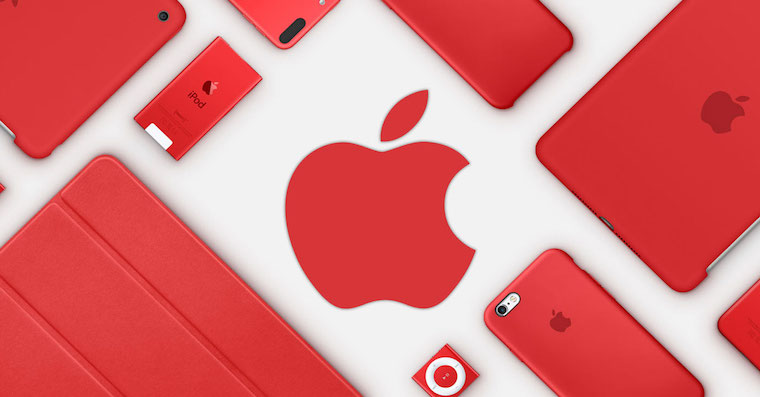
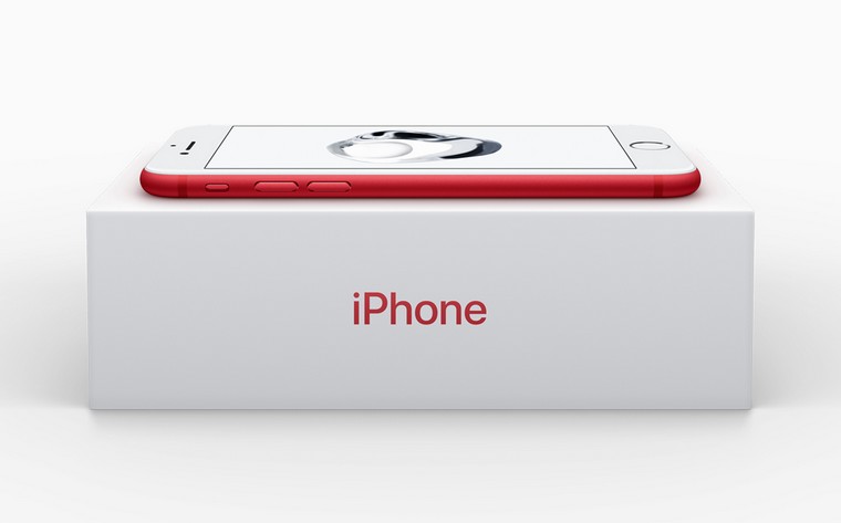
Company logo Apple has become even more simplified since the late 1990s. It has gradually shed its “aqua” look or blue color, referring to the Bondi Blue iMac. Currently, we can see the bitten apple logo in silver, white or black, on the packaging of products in the (PRODUCT) RED has a characteristic red color.