
If you are going to start your own company, under no circumstances should you use an apple or anything that even remotely resembles it as its logo. Otherwise, he could Apple to get unsightly wrinkles on the forehead. The Norwegian company Fremskrittspartiet (translated as Progress Party) knows its way around this. This company is represented by an apple-shaped logo, which AppOf course, I don't like it.
You might be interested in
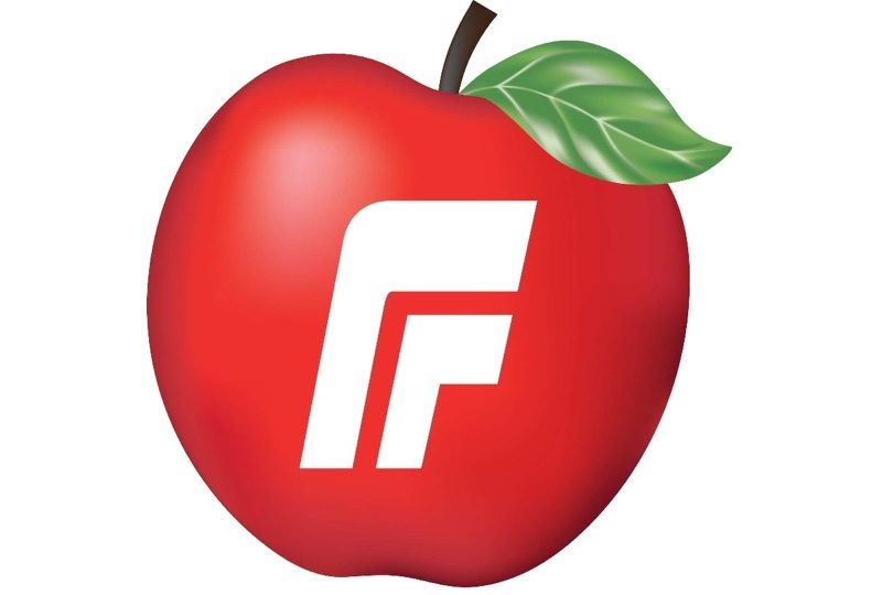
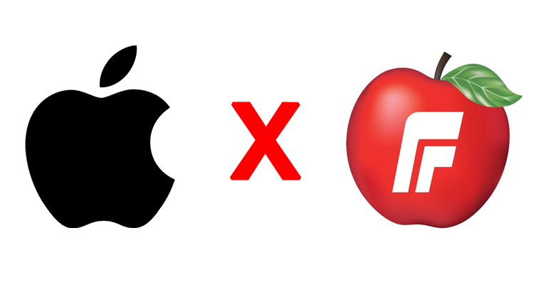
The logo of Fremskrittspartiet differs from the logo of the apple company in almost all respects, and in practice both logos have only the shape in common. The Fremskrittspartiet logo has a red color, a different shape of a stick, a leaf, the letter F in the middle, and it doesn't even have a bitten shape. At first glance, I would never have thought that such a logo could ever be criticized for resembling the one from Applu. However, the opposite is true and Apple recently sent a letter of objection to the Norwegian Patent Office. It states that the Fremskrittspartiet uses a logo that resembles a globally recognized logo Applu, which owns the trademark. People could thus confuse these two completely different companies. The Progress Party has registered its logo for computer software, digital media, paper products, household goods, textile products in the form of flags, clothing and games.
You can see the logos of both companies below:
ProIt is not yet clear how this situation will resolve itself. Apple However, he is not going to let this situation go.chat just like that. He should soon provide the patent office with additional documents that should convince it of the truth of the Californian giant. However, whichever way the plot turns out, it will be rather funny in the eyes of many people. Company logo The Progress Party is different from the logo from Applu really differs in almost every way and is mistaken for a logo Applu is more than unlikely. What is your opinion on this case? Let us know in the comments.

It's very similar!!
Or AppLu and the warmth in the management is already completely burning on the gebulu :D if they would rather take care of the sewing quality they give for overpriced products, it would look a little different..
Tim Crook should be more concerned with making sure his company nestavala fanatical neo-leftist loudmouth. A company whose production is ensured by workers - children, is the last person who should engage in virtue signaling, it is quite hypocritical.
"fanatic neo-leftist" ??? – What the hell are you talking about?
They should probably sue the apple growers. What if someone thought they grew on trees APPLE products.
You don't know what the red cross can do.
Part of the club logo is an unusual plus sign (as a positive). A letter arrived from the Red Cross, saying that no one can use the red cross symbol without their consent. They don't care that it's a plus, it's part of the whole logo.
The world is going to hell. They solve stupid things, but no one prefers to see that somehow it falls apart.
Well, they need a bunch of lawyers for something Apple to use.. Of course it's stupid and even if they had a pear as a logo, so be it Apple he finds something.
I assume that he also invented the shape of the apple apple.
Common sense tells me that this case is complete nonsense, these guys could have had similar malicious intentions, but I see miniTo see the approximate shape given by the template, just look at a book about a hedgehog. (For example, what is this?) https://1url.cz/FMFUN – the abbreviated link leads directly to the image), moreover, the color presentation is not the same, not to mention the letters of the logo.
I myself am curious how this will turn out, I hope that it will be positive for the weaker ones, otherwise I will really say to myself that the world has gone mad.
Oh, and God forbid I set up a cider house. I should probably put a plane in my logo, right? So it doesn't look like an apple. "Aroganc"it is a wig to cover mental baldness" (J. Werich)
It's another category to bite into a pear.
Apple it's just overpriced shit, which is only bought by complex idiots who use this shit to boost their egos...
And the point of this comment on the fan page Apphuh?
Isn't that the only journalist in our country who knows where to write hard and soft i? Already the third server in a row, in the articles of which there is rudeness after rudeness. “…documents that should convince him…”. Otherwise Apple is extremely jealous of his logo and attacks anyone who uses the fruit in any way for his business or organization. Ten years ago, he even sued a Canadian school that had a remotely similar logo. It didn't help that the school in question was a very good customer Applu. A year later, he attacked the Australian supermarket chain Woolworths, where the similarity of the logos was distant, as Windows from the Czech Hunting Association.
well i don't know my phone d Apple it still has support after 5 years and I'll buy everything from the cover to the glass and the battery for it, it still works anyway, it doesn't crash, tell me how long this android of yours will last, and then who has overpriced shit
Here it is beautiful to see what kind of illiterates the iOves are
Yes, my android is also 5 years old and still has the latest updates. It works reliably, it only cost 3/4 less and is compatible with all devices. I don't need to have a rotten apple that has trouble connecting to anything unless it's an apple.
Well, Hruškaři .... what to expect from them ... it's the same case as when their managers and lawyers proudly boasted that they invented the selfie pussy and when they got audiovisual material with a sample from the film, I Killed Einstein, Gentlemen…, which was filmed by Oldřich Lipský in 1969 and where Jiří Sovák commonly uses this thing and is also much more skilled, so they just slammed the door without a word and left…
The apple is a very common fruit, so why should a single company have a monopoly on using it as a logo? The shape and general appearance of this fruit is somehow given in many modifications, so why couldn't another company choose this fruit as a logo too, when there are obvious differences??? So that it doesn't…
Do you want to make your company known worldwide? Give yourself an apple logo, Apple will take care of it 😀😀
At de aplle do pici, their products stand behind the pici
I hope they kick the famous apple to the ground... Big giants don't know how to annoy the neighborhood anymore. In time, they'll patent the shit... and they'll want a fee for every flush.
if I make ciders and no one has a similar apple registered in agricultural and food activities, then I can easily use it, just look at the industrial property office for agricultural activities, where every third company has an apple in its logo ... the only one that has in the area of patents and licenses the mind is Musk
I would use the same one, but I would bite it from the other side
I'd try an apple with a worm, that's all apple he probably didn't.
As far as I know, it is best to turn to professionals and consult with them on all the requirements for establishing a company. I once dealt with this at https://www.cikr.cz/sluzby/spolecnosti-a-obchodni-rejstrik/